Description
Versatility and Ideal Spaces :
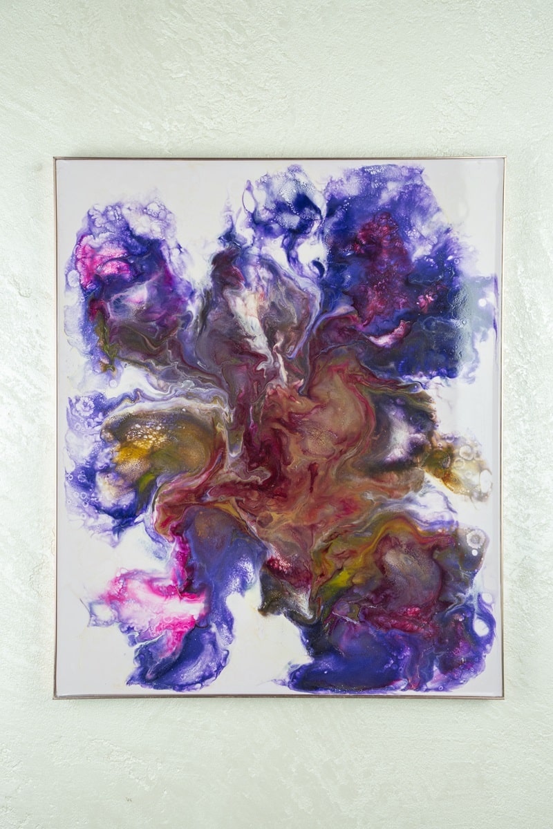
“Iris” is a visual and interior revelation, an explosion of consciousness that takes shape in a chromatic dance of abstract petals and internal galaxies. The title evokes the observing eye and the blossoming flower: both gateways between what is and what can become.
In Iris , matter expands like a deep breath, gliding in fluid movements reminiscent of the universe in bloom. The colors layer like cosmic thoughts, crossing the boundary between form and vibration.
Every fragment of color is a dimension of the soul, every shade a subtle threshold between the visible and the invisible.
It is a work that speaks to those who are ready to open themselves to the mystery, to those who recognize in beauty the language of Being.
“Iris” is the gaze of the infinite that lives within us.
Why choose “Iris”?
- A symphony of emotions and colors: Iris combines form, energy, and light in a fluid work that takes the viewer on an inner journey.
- A breathing work: The material seems to move beneath the surface, giving the work a living, ever-changing character.
- Deep Connection: Every nuance is a trace of the invisible, an invitation to discovery, reflection, awareness.
Colors and Color Combinations:
Iris vibrates in a symphony of deep purples (Pantone 2765 C) , antique gold (Pantone 871 C) , magenta pink (Pantone 233 C) and touches of ultramarine blue (Pantone 072 C) .
The nuances blend in an emotional and symbolic intertwining that recalls the balance between the upper chakras and the subtle worlds.
The choice of colors expresses the union between matter and spirit, between energy and grace.
The work blends harmoniously with refined environments, pairing well with light walls or desaturated tones like Pantone 406 C (Misty Gray) . Placed in bright or welcoming spaces, it adds breath, vibration, and a deeply evocative touch.


Reviews
There are no reviews yet.